Restaurants are always playing around with different menu designs, but for the most part, the look of a menu is a clear indicator of how informal or upscale the establishment is.

Image via wafflehouse.com/menu
Generally, a high-end place will use a simple, elegant design, and often corporate chain menus often have more imagery and detailed descriptions of the food. Casual restaurants are typically attempting to attract customer volume and families, so the menu needs to be engaging as well as easy to read, which helps patrons make decisions quickly.  A server can then get the order to the kitchen, the food to the table, get them paid up, and then get the table ready for the next customers. In the industry, this is called “turning and burningâ€. Speed, however, is not the only advantage to having a vivid menu design. By having pictures of signature cocktails and appetizers on the menu, the restaurant hopes to entice the customer into buying extras. “Mm, those jalapeño poppers look good!† This does not, however, significantly affect the time it takes to turn the table; at a busy casual restaurant servers typically don’t wait for customers to finish appetizers before they bring them their entrées. The opposite is true at more high-end establishments.

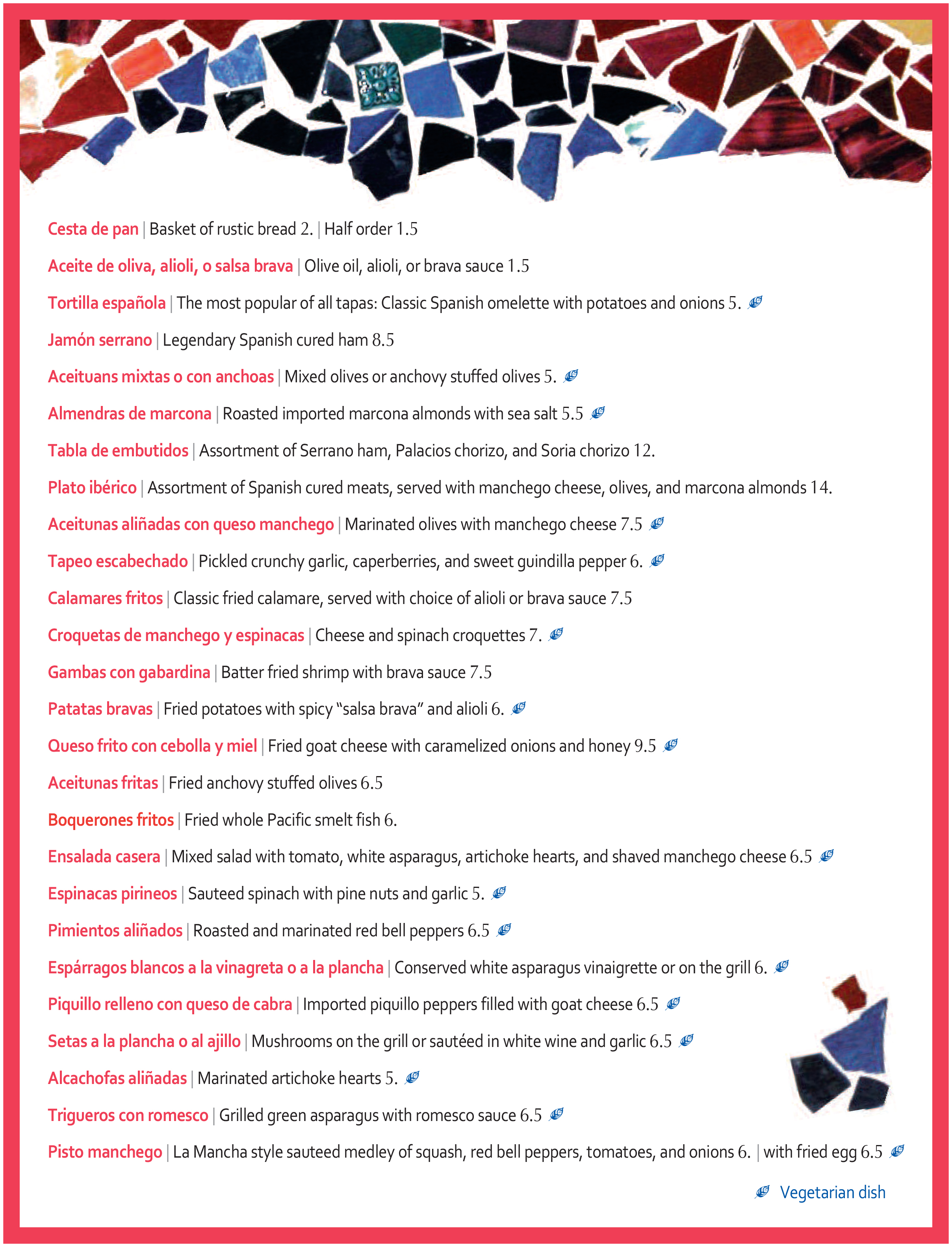
Image via cafemadrid-dallas.com
The menu at a four or five star restaurant usually features a clean, and sometimes vague, menu design. Rather than pictures of the food, there might be some kind of featured art that matches the posh decor. This could include trendy fonts and more complicated, sophisticated layouts. Diners are expected to order more courses, drinks and cocktails, so less emphasis is placed on selling the menu, and more on selling the experience.
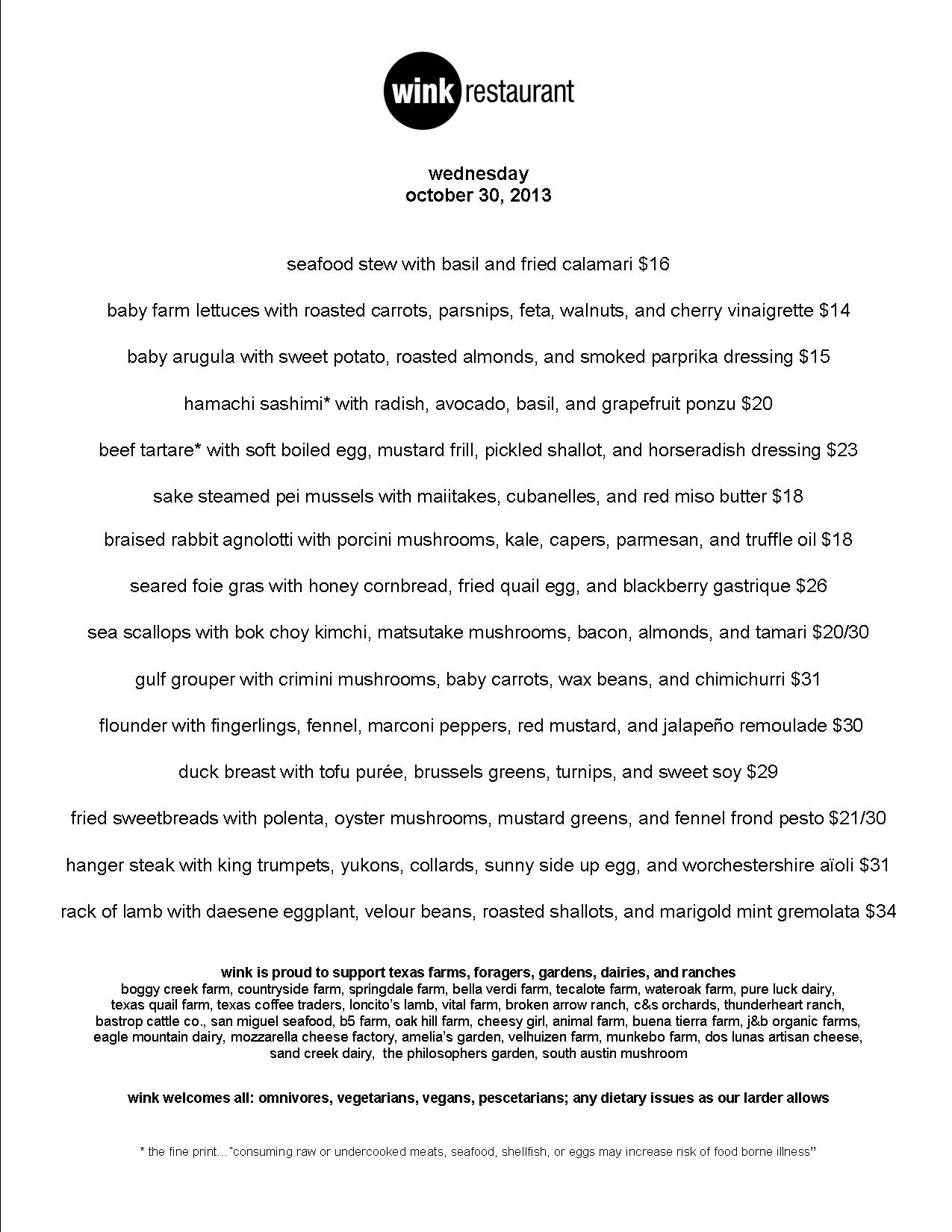
A lot of high-end places in cities like New York and New Orleans have easy access to seasonal ingredients, and will therefore change the menus on a regular basis — sometimes even daily. So, a simple design and streamlined the fonts make it the easier to edit the menu. It is also common for these menus to have vague descriptions of the food with just the protein and a few other ingredients listed. This adds a bit of mystery to the dining experience, and when guests are curious about what all is in a dish, it encourages interaction with the servers.

Image via winkrestaurant.com
There are exceptions to these standards; some restaurants want to pretend they are fancier than they really are with trendy and stylishly laid out menus while others want to downplay and distract from costly food and a pretentious atmosphere with a colorful and vibrant menu. Still, every successful restaurant has an evolving menu design that ultimately suits the establishment and its patrons, and it can go a long way in setting the tone for the dining experience. At the end of the day, whether you’re offering two eggs over easy or the finest redfish courtbouillon, if the quality of the food isn’t there, nice typography probably won’t make up for a lousy meal.
– By Lawson Box
©2013 LLB Designs. All rights reserved.
Works featured are the property of their respective owners.


