As the holiday season kicks into high gear, so does America’s consumer culture. This naturally means more shopping and thus more advertising. Design and advertising go hand in hand, and during the months of November and December most marketing efforts feature traditional holiday icons such as red, green, ornaments, pine trees, etc. The timing and the subject matter may not have changed much, but the methods have. Within the last ten years or...
Out and about: And for your main font?
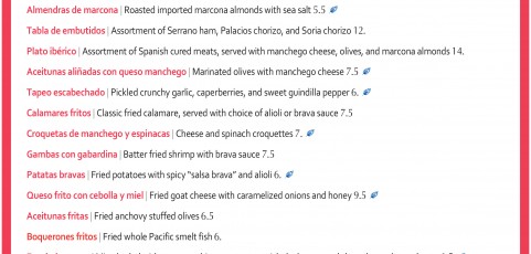
Restaurants are always playing around with different menu designs, but for the most part, the look of a menu is a clear indicator of how informal or upscale the establishment is. Image via wafflehouse.com/menu Generally, a high-end place will use a simple, elegant design, and often corporate chain menus often have more imagery and detailed descriptions of the food. Casual restaurants are typically attempting to attract customer volume and...
Out and about: At the movies
Image via maxseesmovies.blogspot.com As with most types of design, movie credits can range from very minimalistic to long and complex sequences. All intend to capture and engage the audience while showcasing the title, cast, and crew, and it’s interesting to see how the trends change over the years. The use of an intricate and glitzy design to display the title and credits is far more common in older films. A lot of classics have an...


