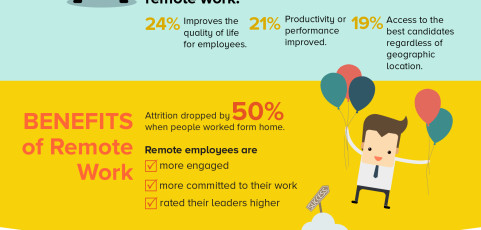
Take a look at this fun (and informative!) infographic developed by 15Five and designed by Laura Lee Daigle of LLB Designs.  Colorful sections and whimsical illustrations help pack a lot of information into one engaging graphic. Read more about it on 15Five’s site here.
eBook design
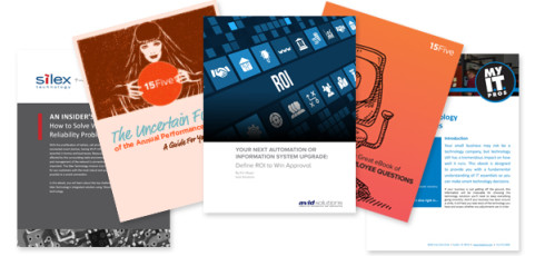
There have been a lot of eBook and whitepaper design requests coming down the pipeline the past several months. Developing your own original content is an important part of a company’s marketing strategy and a relatively low-cost way to get your ideas and brand out there. A well-designed eBook is eye-catching but clean and easy-to-read. It should work well with your branding, but have a bit more of an editorial feel to it as opposed to...
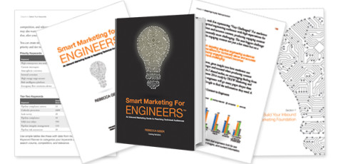
Smart Marketing for Engineers book design
Take a look at Rebecca Geier’s newly published book, Smart Marketing for Engineers. This was a big project for LLB Designs in 2015 and it has been very exciting to see the book come to life. Â The project included the design of a 235 page book as well as covers and front matter. The book was published in hardcover as well as Kindle and eReader electronic versions. We also designed promotional materials including an author one-sheet...
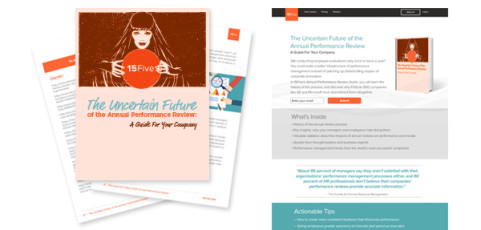
15Five: An Uncertain Future eBook
15Five is an exciting new LLB Designs client out of San Francisco, CA. They recently published an eBook, “The Uncertain Future of the Annual Performance Review” This colorful and fun eBook gives a history of the the Annual Performance Review and offers insights on why some companies are abandoning the process in favor of more innovative and effective ways of managing employee growth. The eBook design is by LLB Designs, as is the...
Wineman Technology feature graphic
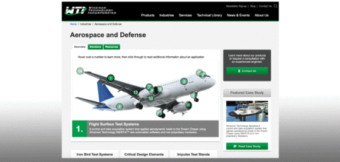
Take a look at this interactive feature image on the Wineman Technology website. Longtime partner TREW Marketing asked us to help create a dynamic, interactive image for Wineman’s Aerospace and Defense page. The different areas of the plane are numbered and as you rollover the numbers brief descriptions of the different sections are displayed in the easy-to-read box below. It is an intuitive and fun way to present a lot of information in...
Building Bridges 2015
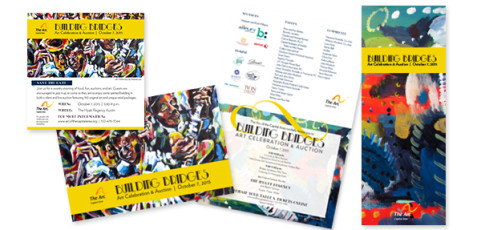
This year’s Arc of the Capital Area Building Bridges fundraiser materials may have been the most cohesive and impactful yet. The lively artwork perfectly reflected the jazz and art deco theme. Special attention was given to online and digital components which coordinated with the more traditional printed materials beautifully. The event was a big success for the Arc and is always an honor to be a part of!


