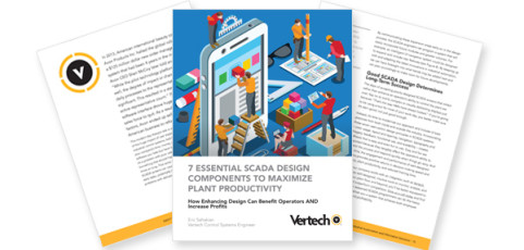
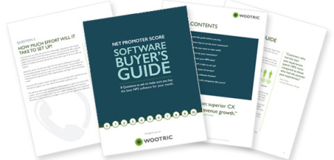
Bright graphics paired with a clean, easy-to-read layout help this eBook to stand out. The pages are easily printed in addition to being easy to read in digital formats. The colorful illustrations compliment the corporate colors while adding a lot of visual interest to maximize engagement.
Wootric eBook design
This clean and fresh design uses corporate colors and crisp icons to highlight their content. The information is clear and easy to read in digital formats, which is key with eBook designs.
Logo design and branding
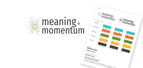
Take a peek at this logo that works in tandem with a bright custom color palette to pack a punch. We love the timeless sans serif font, easy to read design and overall bold look that is fun yet very professional.
Website refresh
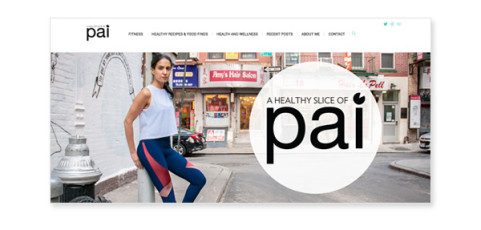
Here we have a sleek and cool logo and homepage design for the sleekest and coolest of clients! The logo is minimalistic but meaningful, and easy to read both in small and large applications. The website highlights the gorgeous custom photography but keeps to the same polished, sophisticated look.
PowerPoint design
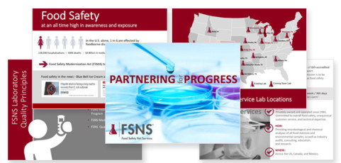
This engaging presentation for the food safety industry checked all the boxes…stylish icons, impactful photography and crisp fonts. The result was strong corporate branding with a playful, interesting aesthetic.
Logo design
The fabulous Sarah Wheat of Sarah Wheat Design knew exactly what she wanted in a logo for her new interior design business. Simple, elegant design and typography create a timeless, versatile logo that is minimal, yet still makes a big impact.


