Image via maxseesmovies.blogspot.com As with most types of design, movie credits can range from very minimalistic to long and complex sequences. All intend to capture and engage the audience while showcasing the title, cast, and crew, and it’s interesting to see how the trends change over the years. The use of an intricate and glitzy design to display the title and credits is far more common in older films. A lot of classics have an...
Social sizing
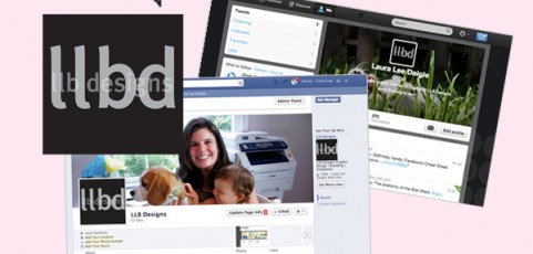
Check out this extremely useful post on Facebook image sizes. We recently gave our Facebook and Twitter profiles a fresh new look…follow us here!  Facebook  Twitter
Correspond: Letterhead and notecards
While a lot of traditional business memos, letters and the like are now replaced with e-mail, the need for custom letterhead does still exist. The good news is that long-gone are the days where young businesses had to shell out hundreds of dollars for thousands of sheets of letterhead. Digital printers can handle smaller quantities at very reasonable prices. Others take it a step further and create soft-copy templates in Microsoft Word, which...
Logo logic
When setting out to establish a brand for a new company, one of the first key elements to tackle is the logo. And while a logo is not the entire brand of a company, it is one of the most important pieces. A logo should be used consistently as a signature on just about everything a company produces: product labels, marketing materials, advertising and websites. And don’t forget other, less obvious places such as invoices, e-mail...
Colorful language: RGB vs CMYK
Ever scratched your head and wondered what the difference is between RGB and CMYK? And what are those Pantone things, anyway? We were all geared up to tell you, but it turns out the fine folks over at Designer Today have this one covered! This concise but informative little article breaks it all down with great high-level definitions and explanations: http://www.designertoday.com/Articles/5946/Color.Models.in.Graphic.Design.aspx As a basic...
Try it on for size (a guide to envelopes)
Without a doubt, the number one rule when designing an invitation or a direct mail piece is to start with the envelope size and shape. Many a sad first-time designer has designed and printed a gorgeous piece only to find out that it’s a non-standard size and that matching envelopes just don’t exist. And as having custom envelopes made is crazy expensive, this is a problem to avoid at all costs! Fortunately it’s a lesson quickly learned...


