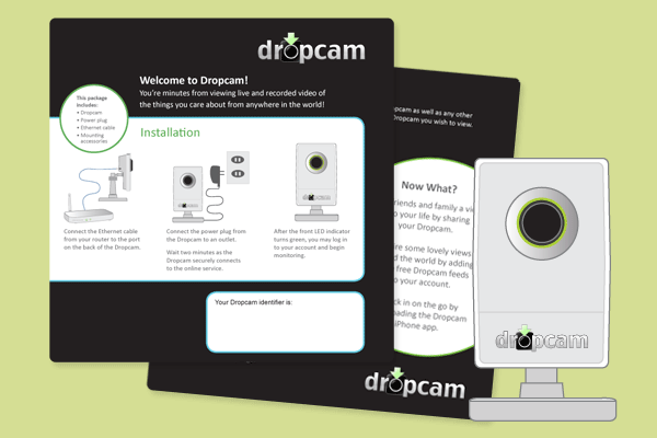
Congrats to Dropcam!
Back around 2010-2011 we did some design work for a tiny San Francisco startup called Dropcam. We were (and still are!) big fans of their products and had a good feeling about them. Last week the now not-so-small company was acquired by Nest (which itself was recently acquired by Google). We are so proud of the Dropcam team and excited to see what they do next.
read moreHome Building News Magazine
Here is a peek at the latest issue of Home Building News, a publication of the Homebuilder’s Association of Tulsa. We dressed up the publication with a streamlined masthead, clean, attractive layouts and playful icons. The overall look is professional and appropriate, but still fun and relaxed.
read moreThe Thirsty Quail
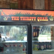
Take a look at this unique and envy-worthy refrigerator for a new outdoor kitchen. Our client asked us to design a custom sign featuring quail and cacti with a fun, Texas flavor to it.  It turned out great, and was a blast to work on. We’re pretty jealous of the fridge and also impressed with the coolness of  what looks to be a reclaimed wood wall behind it. Nice work, Covey family!
read moreFUMP Music Festival
Ever seen a kiddie mosh pit? We at LLB Designs were excited to sponsor the FUMP Family Music Festival again this year. The event featured several great children’s bands, an appearance by Elmo and Cookie Monster, games, prizes, a silent auction and more. Not only was it a fun event, but it involved great design, too. Check out the beautiful website design by Andrew Leeper below.
read moreWord.
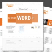
Check out The Creative Word PR’s sleek and stylish website! It was exciting to create this new website for one of our favorite strategic partners. Anne and Melissa wanted something clean and modern, focusing on their core niche: public relations and writing for small businesses and nonprofits. The final result is a WordPress website that is sophisticated and professional, but with well-defined branding and punchy colors. The rotating hero graphic is unique and reinforces the company name and specialty, while their cheeky blog, WORD,...
read moreCapitalines magazine
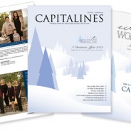
Take a peek at the most recent issue of Capitalines Magazine! Laura Lee Daigle is the 2013-2014 editor of Capitalines, which is a publication of The Junior League of Austin. It covers the League’s community and non-profit programs and grants, as well as details on their big fundraiser, A Christmas Affair (ACA).  The full online version can be found here. The fall issue has a circulation of over 3,000, and the shopping guide is distributed to 20,000 guests during the ACA event. More information about the publication, including a media...
read moreOut and about: Is your shopping list covered?
As the holiday season kicks into high gear, so does America’s consumer culture. This naturally means more shopping and thus more advertising. Design and advertising go hand in hand, and during the months of November and December most marketing efforts feature traditional holiday icons such as red, green, ornaments, pine trees, etc. The timing and the subject matter may not have changed much, but the methods have. Within the last ten years or so, more people have opted to avoid headaches like this: Photo courtesy of abcnews.com In favor of...
read moreOut and about: And for your main font?
Restaurants are always playing around with different menu designs, but for the most part, the look of a menu is a clear indicator of how informal or upscale the establishment is. Image via wafflehouse.com/menu Generally, a high-end place will use a simple, elegant design, and often corporate chain menus often have more imagery and detailed descriptions of the food. Casual restaurants are typically attempting to attract customer volume and families, so the menu needs to be engaging as well as easy to read, which helps patrons make decisions...
read moreHip hip hooray!
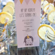
There is nothing cuter than a first birthday party, and this one, complete with hippo theme, was extra fun. The invitation was by LLB Designs, and the photography was by Bridget McPherson. Â The rest was all coordinated by the proud parents, and do doubt involved a lot of shopping on etsy and driving around town rounding up mason jars. Congratulations, and well done! Photography by bridgetmcpherson.com
read moreOut and about: At the movies
Image via maxseesmovies.blogspot.com As with most types of design, movie credits can range from very minimalistic to long and complex sequences. All intend to capture and engage the audience while showcasing the title, cast, and crew, and it’s interesting to see how the trends change over the years. The use of an intricate and glitzy design to display the title and credits is far more common in older films. A lot of classics have an overture play while the credits are shown against stills from the movie. This is particularly true of...
read more


