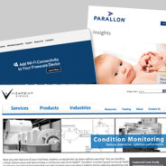
Simple updates, big impact
One quick and relatively easy way to keep your site fresh and up-to-date is to periodically replace the feature images and hero graphics. This one change can make a big impact, while still maintaining your site’s existing branding and consistency. It’s also a great way to highlight your latest news, products or events. Shown above are recent feature images we created for Silex Technology, Viewpoint Systems, and Parallon. All projects were managed by TREW Marketing.
read moreEven More Hands On
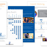
We’ve been lucky enough to work with Hands On Atlanta on several projects over the last few months, including the recently posted Soiree event. Â This neat organization has also been putting together a 25th anniversary campaign, as well as coordinating a variety of ongoing events including MLK day volunteer activities, Family Service Saturdays, corporate volunteer days, and more. We jumped in and helped out with campaign and fundraising documents, as well as logos and signage for various activities and events. Â It’s always a...
read moreSoiree for Hands On Atlanta
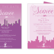
Hands On Atlanta put on yet another great event: Soiree for Hands On Atlanta. This elegant fundraiser and auction also celebrated Hands On Atlanta’s core work, their role in the community, and of course honored their very dedicated volunteers. LLB Designs created the save the date and invitation, signage, and other event materials. We loved the unique use of fuchsias and pinks, which created a distinctive and fun vibe throughout the event lighting, linens, flowers and printed materials. Well done, HOA!
read moreCanyon Vista Guest Speaker Series
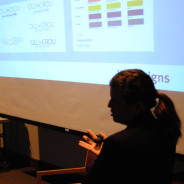
Laura Lee Daigle recently participated in the Canyon Vista Journalism’s Guest Speaker Series in Austin, TX. She spoke to news media and yearbook students on graphic design, branding, and her career in marketing and design. The presentation included interactive exercises such as “Guess the Brand” and “Let’s Make this Poster Design Better” as well as an overview of key design principles and Daigle’s portfolio of work. A casual and fun Q&A session followed the presentation.
read moreMills Wine Group logo
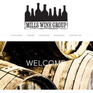
An overdue sneak peek at a logo we did for Mills Wine Group in the California Bay Area. We love the rustic font and cool, stamp-like feel of both the full logo and the smaller option that we created for additional flexibility. The bottles all grouped together remind me of a gathering or party, but actually made my husband think of a skyline. It looks great on their web page, and was all in all a fun project with a fun client. Bottom’s up!
read moreHands On Atlanta t-shirt
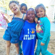
Take a quick peek at this cute photo of the t-shirt design we recently designed with Hands On Atlanta!
read moreOLLI + CROU logo and branding
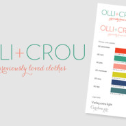
New children’s resale shop Olli + Crou came to us looking for a logo and color palette. Owner Amanda has great taste and we love the results! Â The final branding package included a detailed color palette, font guidelines and several color options for the logo.
read moreBuilding Bridges 2014
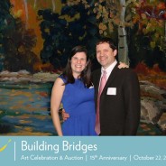
The 15th anniversary of the Arc of the Arts Building Bridges event was a success! We designed the save the date, invitation and program for the event. Each featured two beautiful pieces of artwork: “Serenity in Fall†by Arc of the Arts Artist Nancy D. and “Perpetual Light†by local artist Rebecca Patrick. We pulled some of the reds and blues from each piece to tie the collateral together. The invitation was a unique matchbook fold, which also housed a separate insert card. Thanks for a wonderful evening, Arc! Photo courtesy of...
read moreThe Final Coat logo
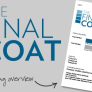
We got to design a logo for this great new business out of Houston, TX. The Final Coat is a high-end painting company specializing in both residential and commercial projects. They wanted a crisp, classic logo that would stand out in a field of swishy paint brush  and splattered paint can logos. The final result features subtle typography that plays on the name and emphasizes the quality of the company’s work. We also spent a lot of time fine-tuning the shades of blue — looking for a shade a touch darker than royal blue,...
read moreCapitalines magazine, Spring 2014
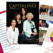
Here is a look at the spring 2014 issue of Capitalines Magazine! Laura Lee Daigle wrapped up her term as  2013-2014 editor of Capitalines, which is a publication of The Junior League of Austin. This issue featured a custom cover photo shot by Debra Gulbas Photography, design by Andrea Turner Jacobs, and 80th anniversary artwork by Terrence Moline of TeamMoline. Custom infographics, fun and informative articles about local non-profit programs and high quality photography made for an eye catching and entertaining issue. The full online...
read more


